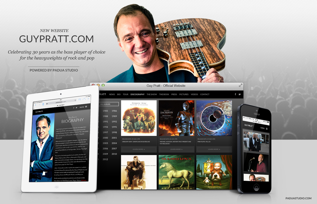
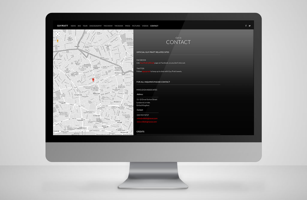
As in 2006 we developed the new site of Pink Floyd and Roxy Music bass player, Guy Pratt.
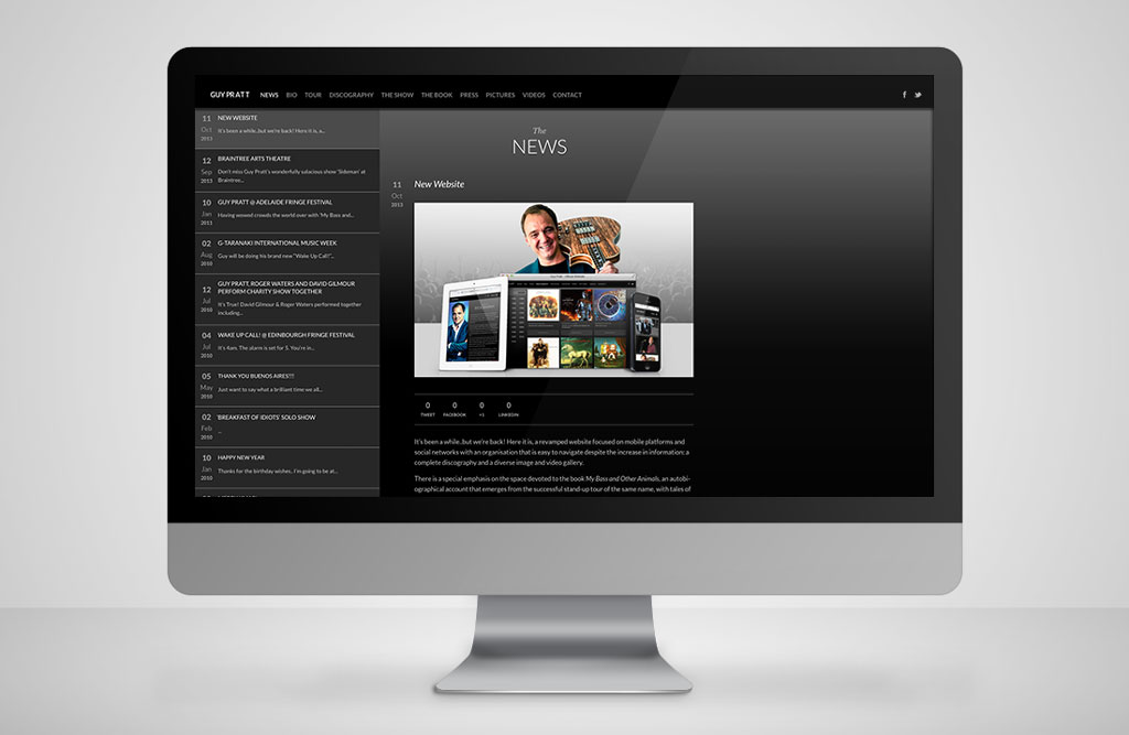
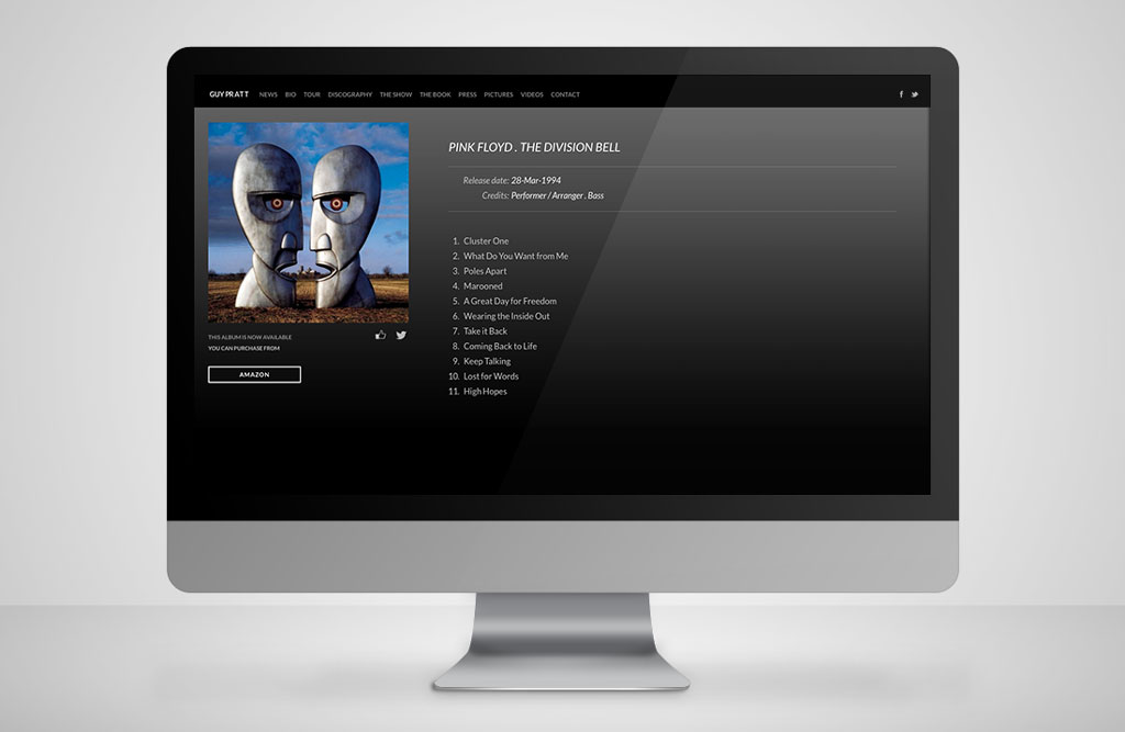
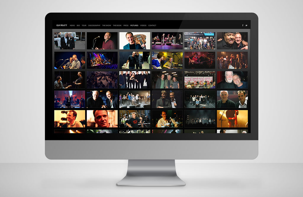
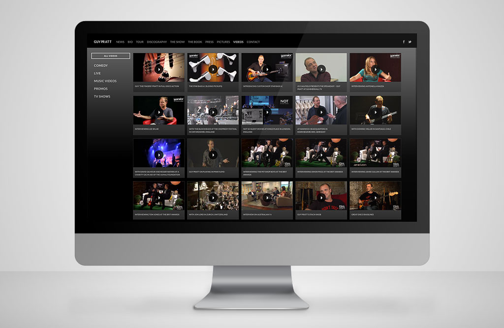
A revamped website, focused on mobile platforms and social networks with an organisation that is easy to navigate despite the exponential increase in information: a complete discography and a diverse image and video gallery.
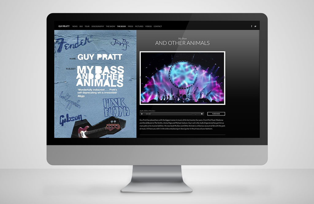
There is a special emphasis on the space devoted to the book My Bass and Other Animals, the hilarious autobiography that emerges from the successful stand up show.
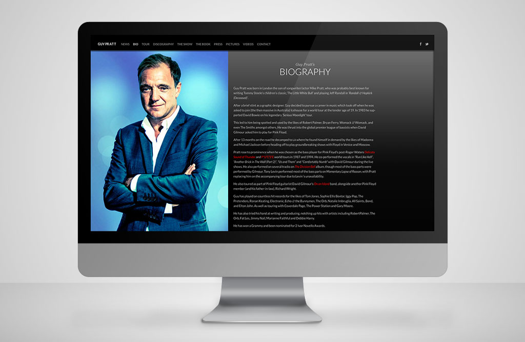
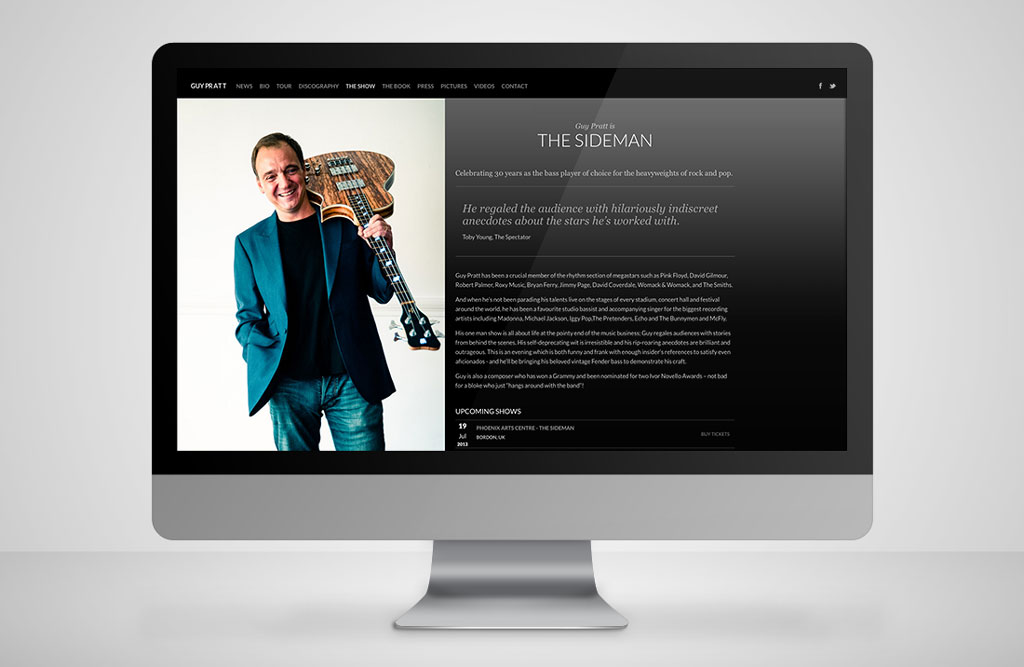
Guy Pratt is a composer, musician and comedian who is celebrating 30 years as the bass player of choice for the heavyweights of rock and pop having worked with leading names such as Madonna, Michael Jackson, Julian Lennon, Gary Moore, The Smiths, among others. He is a Grammy winner and has been nominated twice for the Ivor Novello singers and songwriters prizes.
Case Study
OpenSource, WordPress, HTML5 and CSS3
In the development of any website we must take into account of the customer’s need to manage or delegate the management of his own content, by providing autonomy in simple tasks such as publishing news, changing text or uploading images to the photo gallery. We addressed this by creating the website based on the Wordpress platform, which provides an administration system that allows this type of management.
This platform initially emerged as a blog tool and has now evolved so much that it can be used to create much more complex websites – it is estimated that 15% of all websites worldwide use Wordpress and 65 % of websites use it to as a content management platform.
WordPress has been establishing itself increasingly as a tool of choice due to it’s ease of implementation, linear content publication flexibility and integration with social networking. These features have been improved since the beginning of the project by thousands of programmers who collaborate on this opensource project.
The advantage of opensource applications is that their source code is constantly updated and improved, both in terms of performance and system security – unlike proprietary systems that rely on a single team with a consequent increase in project costs for fault resolution and improvements over the life of the project.
The construction and development of the WordPress platform is based on the combination of PHP and Javascript as programming languages, Mysql for databases and the latest version of HTML 5 and CSS 3 for the visual structuring of the pages.
The special feature of the last two is that they enable the creation of previously impossible animations and behaviours, frequently associated with Flash technology. We also explored these features in this project.
Responsive Web Design, Device Agnostic and Media Queries
The market proliferation of hand-held devices such as smartphones and tablets has changed approaches to the interface design paradigm. While previously a web designer’s concern was how websites would be presented in different desktop browsers, the daily challenge is now to develop something hybrid for all of these devices. It is impossible to avoid this issue given that almost 20 % of website visits are on mobile devices and the trend is towards increased traffic through mobile equipment.
Interaction with a website from a PC is completely different to a tablet, which is different to a Smartphone and even different to a Smart TV, given factors such as the touch, the touch or click surface and area and different screen sizes and resolutions.
For this project we chose to build a responsive design, which is a way of constructing the interface, and the actual coding that provides a great user reading and navigation experience with minimal resizing and movement (scrolling) of the display area regardless of the device.
The development of a responsive interface takes account of factors such as navigation elements, layout, text, images, video/audio players and other graphic elements that are adjusted on all devices, in a consistent display, thus making it unnecessary to create specific mobile or desktop versions of the same website, as was previously the case. In the present and in the future, “A website will adjust to all devices”.
Fixed and Mobile 3D Menu
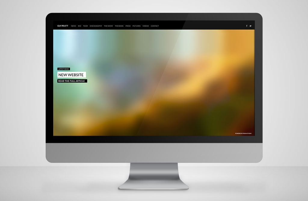
The website that we have developed has an upper navigation menu that allows the visitor to access any part of the website. The fact that it is fixed allows for constant visibility regardless of the display area that the user can see and regardless of the page being queried.
As the menu is extensive and has a lot of items, it would be impossible to continue with the same approach for devices with smaller screens. We therefore decided to create an innovative menu that allows the user the same freedom and ease of navigation.
The mobile menu was built and based on the recent CSS 3D transformation properties that create three-dimensional rotation of the page when selected.
The user can use this option to view the full contents and when the menu is selected the page is rotated in 3D and on it’s back is a list of all navigation items.
Isotope and filtering
As a rule, when the user tries to access various contents, s/he has to change the page and wait for it to load. This makes the process time-consuming and laborious, and sometimes the user loses interest and abandons the content display.
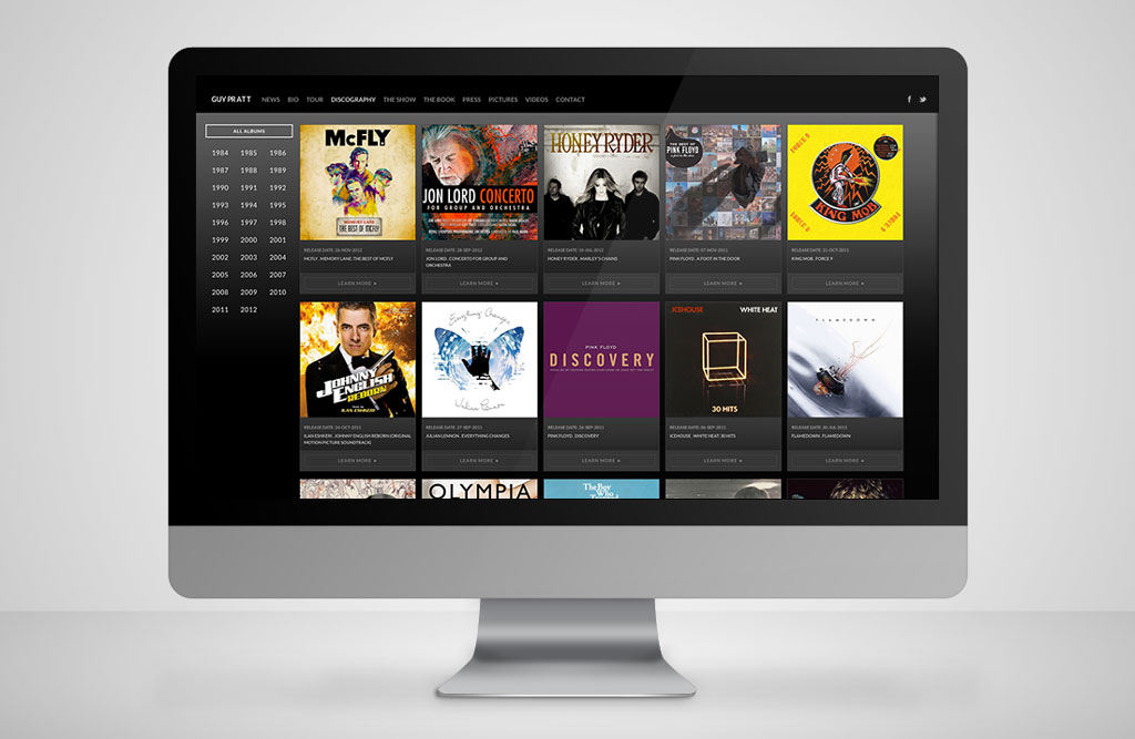
In this particular case the discography section alone lists more than 150 albums. To avoid this situation of an ever-changing page, we chose to include dynamic time-filtering of the albums and filtering by category for the videos. This is done using a Javascript library called Isotope that allows the visitor to access the desired content directly without leaving the page, thus improving both navigation and usability experience as well as navigation speed on the website.
Infinite Scroll
The most common website paging process involves page numbering that requires the user, when s/he reaches the end of the page, to go to another page to view the remaining items – this is slow and often leads to the user abandoning the website and not bothering to search beyond the initial display.
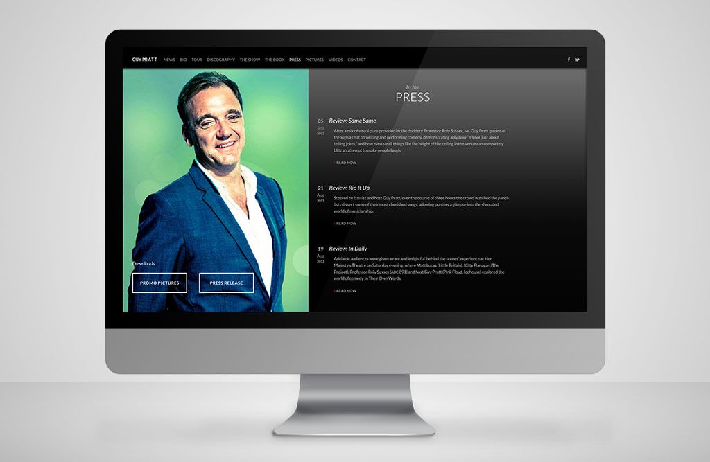
To minimize this situation we adopted an infinite content scrolling system for press releases and events. So whenever the user reaches the bottom of the page it displays new items in the same chronological order, so there is no interaction effort and the full content is accessed.
Events Map
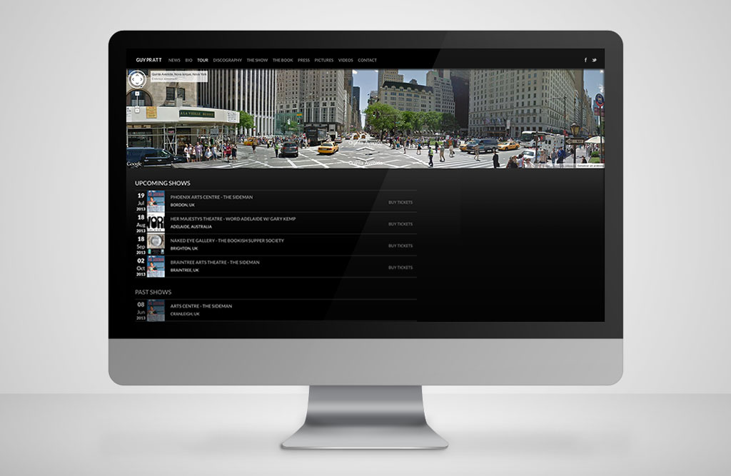
To complement the list of events we included a direct ticket purchase option and an interactive map that allows the user to geo-reference the location of the scheduled events.
The user also has the option of using the Google Street View system associated with the event without leaving the page itself, where users can browse and also view 360-degree panoramas of the venue where the event will take place.
SEO and Social Networking
The consumer’s decision-making power in choosing a product, service or any other content has become increasingly crucial and now that geography is no longer a barrier, the number of potentially interested consumers has grown exponentially.
Given that search engines and social networks are key factors in dissemination it is vital to understand how they work in order to optimize content so that users can quickly and easily arrive and to create the desired return.
SEO (Search Engine Optimization) is a set of rules normally associated with the construction and publication of content by the website, SaaS (Software as a Service) or any other web application.
These rules seek to provide better positioning of the website’s reference in search engine lists because these directly affect consumer choice given that the consumer normally prioritises the first links that are displayed.
Compatibility and Problems
Before the publication of any web project it is advisable to check its validation and compatibility with the different browsers on the market. This is a very important step because not all browsers use the same website rendering engine and the result displayed on screen is therefore different depending on the browser, which causes considerable confusion for end users.
To get around this problem, we considered the different browsers on the market, but we also had to check the behaviour of the website in different browser versions as there are still users navigating with earlier versions. Given these factors we developed adaptations for the website so that it would behave the same way regardless of the browser and version.
The main menu has a fixed position when displayed on screens with a resolution higher than 959px. At lower resolutions the menu is compressed for mobile applications. However in this adjustment, when the CSS 3D transformation rotation option is applied, the browser does not recognize the positioning, which moves from fixed to absolute and it disappears after the page is scrolled.
To resolve this issue we decided to apply a scroll system to the entire contents except the menu – except in this case the scroll needed to identify the page height in order to function. We found that, contrary to our expectations, a block with 3D transformation cannot identify the height of the screen 100%. We addressed this by using a JavaScript routine to assign the screen height, to allow the correct scroll height to be defined and to keep the menu fixed in the same location.
In reality, it gives the illusion of being fixed, but it works.
Library Optimization and Reduced waiting time
These days the average time it takes a website to load and capture the user’s attention is about 5 seconds.
That said, a significant proportion of the reasons for abandoning websites is the time they take to load. Given this situation we optimized the website to the maximum so that navigation is smooth and linear, without excessive waiting time for the full display.
The method we devised for optimization of the site started by using Pingdom, which is a complete tool for testing page loading and opening speeds. It was quite useful because it provides an opening speed report for each page and a report of the download times of each file in the page. The data collected was used to tweak the code, files and platform.
We used Gzip compression to enable the file to be compressed on the server and opened on the client, which vastly reduces download time.
We activated a Cache system, because this limits function calls from static pages, such as calculations processed by the server, resulting in faster release of content to the user.
We removed non-essential JavaScript and CSS library calls from all pages. We then proceeded to minify and consolidate them.
Minifying means removing non-essential characters from within the file, thereby reducing its size. Using file consolidation we were able to combine several files in a single file, again reducing the weight and number of requests to the server.
Images, which are generally the heaviest and therefore the slowest content, were optimized for reduced download time.
Finally we used a CDN or Content Delivery Network to dramatically increase the speed of the website. This system enables the site to be distributed to a range of datacenters around the world to bring the content closer to users and decrease the wait time to receive them.
All these optimizations resulted in a significant increase in the website’s speed and response. Performance improved by 150%, resulting in a pleasant experience for visitors.
